Gabbi.
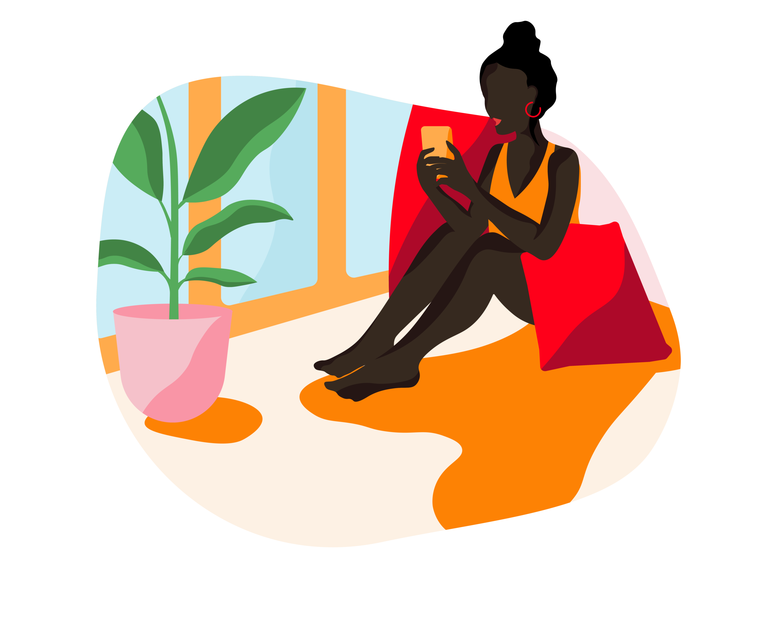
Illustration supplied by Gabbi
-
The Instagram post was Gabbi’s first impression and needed to capture attention immediately while clearly communicating its purpose. The original post read “Do you know the risks?” with an illustration of three girls. While visually appealing and consistent with Gabbi’s bold illustration style, the message felt vague and it was unclear what risks were being referenced.
I recommended strengthening the hierarchy by introducing a more empowering primary tagline, “Empower Yourself,” supported by “Do you know the risks?” as a subheading. As the Risk Calculator assessed breast cancer risk, I replaced the image of the three girls with an illustration of a breast to make the subject explicit and reduce ambiguity. The original illustration of the three girls was then used on the following slide to maintain brand consistency and narrative flow.
I also proposed adding a clear “Start Quiz” button to create a simple call to action and make the first step obvious.
-
The original Instagram post directed users to a “Sign Up” page. I suggested allowing users to start the quiz immediately rather than requiring registration. Health can feel invasive, so the approach should be more passive. I also questioned whether trust needed to be built before asking for an email.
My assumptions were:
Users may be sceptical of doctors and hesitant to register with little context.
Privacy and email spam concerns.
Users are time poor, particularly if commuting.
Users should be able to access the quiz quickly and simply, with a quick app download followed by the questionnaire. I also recommended including a short “Breast Health Calculator” summary on this page to better inform users about the quiz.
-
The objective was to keep the user engaged. As the target user was likely time-poor, the experience needed to feel simple, clean and easy to move through, with subtle prompts to maintain momentum.
I recommended starting with straightforward questions such as age and ethnicity, allowing users to ease into the process. As their investment increased, the questions gradually became more specific, including family history and personal health factors.
To support engagement, I suggested adding visible progress indicators (e.g. 1/10) so users could clearly see their progress. I also introduced prompts such as “You’re almost there” and “Lastly” to reassure users and create a sense of completion. These cues were designed to reduce friction and make the experience feel manageable from start to finish.
-
I added the tagline “Step One to Empowerment” to reinforce the message about taking more control over your health. The calculation pages needed to be informative, but we were conscious not to overwhelm or intimidate the user. I used Gabbi’s softer colour palette and integrated an illustration to soften the impact of the risk factor percentage. The “View Your Action Plan” and “Join the Community” buttons were kept clear and concise to encourage users to move forward.
-
The user is time-poor and likely on the go, so I recommended keeping the sign-up process as quick and straightforward as possible. Another assumption is that these days, users do not always know their email passwords off by heart, so I included options to sign in via Facebook, Google, and Apple. That way, creating an account can feel almost automatic.
-
My approach was to utilise Gabbi’s beautiful illustrations, so I applied them to the tiles as well as a subtle background. I used this aesthetic across the app to create a consistency between pages.Text is bold and clear, keeping in line with Gabbi’s style guide. After receiving feedback from the client, I went on to develop Gabbi’s community pages. This included the Community Dashboard.
-
The client’s CEO was keen on having the groups as scrollable tiles. I categorised groups based on user’s risk factor (clients suggestion), health interests and popular close by. I developed these categories based on the scenario - my assumption was the user wanted connection and to find like minded people with similar issues. By categorising groups based on interests and location, the user is able to find and interact with similar user’s. User’s also have the option to “Start a Conversation” or “Browse Other Groups”.
After I conducted some userbility testing, my suggestion to the client was to reduce the two dashboards into one main one, as user’s found it confusing. I discussed with client and we decided to merge the two with the tiles being “Join A Group” “Gabbi Gals” “Action Plan” and “Track Your Progress” Gabbi Members can fall into “Gabbi Gals” while “Expert Tips” is scratched and falls in with “Knowledge is Power” which are articles that are not “expert”. This was to avoid strict U.S health laws. I have found the collaboration with the client to find solutions an absolute delight and an imperative part of the process. The refines are currently a work in progress
-
The main objective was to have user’s interact and engage with each other, promoting inclusion and connection between members. My design approach was clean and concise due to being a content heavy space. As well as a place for members to have a conversation, it has been designed to encourage members to share. Client was keen to have user’s share their action plan steps, so I integrated prompts within the threads. Each group would have customised prompts, ie. a PCOS group would maybe have “Share Your Diet Tips” as diet is an important part of treating PCOS.
I also implemented the following suggestions:
Pinned posts
Similar to Instagram I suggested user’s can “like” posts but the number of “likes” are not shown so user’s are not influenced to post by the number of “likes” they receive.
User’s can reply to posts - very important to make reply option simple and predominant as we want to encourage conversation and interaction between user’s.
Opportunity for call to action prompts. “Share your progress?” “Say hello?” “Connect with Gabbi’s,”
Consider “stories”? Assumption is that user’s enjoy sharing videos a form of communication these days ie. TikTok, Facebook and Instagram Stories.
When discussing the vision for group threads, I noted the client wanted to “start small and eventually grow”.
Start with limited features and grow as the user base does.
Keeps users engaged and interested with the “what’s new” element.
Create a strong & solid structure. Opportunity to implement ideas down the track as the app evolves when user numbers grow - add more features, sub elements that are suitable to user needs ie. groups within groups, more privacy options, ranking incentives, main forum (international).
Organic growth rather than trying to fit too much in and overwhelming users.
Prioritise what is most important and comprehensive.
-
The client liked the idea of presenting matches similar to a dating app but in an innovative way. My solution was to avoid using the words “connections” or “matches”, I suggested using a term like “Gabbi’s” or “Gabbi Gals.” Similar to Tinder, a profile tile appears and you can either swipe away “maybe later”, “give a wave” or view the profile. Matches are based on risk factor, location and health interests.
-
Consistent with the apps group threads, information heavy pages are visually clean and simple. The off white background with splashes of colour keeps the interface fun and playful. The aim was to have the overall app looking sophisticated yet soft. The Gabbi Gals profile is designed for user’s to view other members information and location, compare actions and groups, and prompt a chat or send a wave. The profile can also show the members risk factor which is optional.
-
Again, the interface design for this page is simple and clear, giving prominence to members information and “connect option”. User has the option to message/connect.
Once “Connect” is tapped, a message window pops up with options to “Start with a Wave” or “Break The Ice” Starting a conversation with a stranger can be hard for user’s, so to help the process along, I’ve added “Break The Ice” chat prompts.
-
Knowledge is Power and Expert Tips will be merging to form one page full of articles on women’s health and issues. Articles are categories based on user’s risk profile, health interests and trending. Similar to Netflix, I suggested user’s are engaged with articles/shows that a trending, as it helps build a connection with others. It also helps as with talking points - after all being up to date with issues and stories always helps a conversation. I designed the interface similarly to “Join A Group” with scrollable tiles to browse. Once you tap into an article, the design is again simple and clean to give prominence to the content.
-
Currently, Navigation bar is a work in progress. Client feedback suggested “Home” icon to be moved down to the bar so there are not two points to navigate. After further discussions, we also came to the conclusion that the navigation bar is fluid, so there is further opportunity to build more into it.
Notifications
Favourites / Saved
Messages
Profile
UI Designer, Gabbi.
2021.
User Interface Design
Critical Thinking
User Experience Research
Mid-High Fidelity Wireframes
Prototyping
Usability Testing
Gabbi is a U.S.-based non-profit focused on women’s health. As part of its broader initiative, Gabbi was developing an app designed to help users assess and track their risk of developing breast cancer. Beyond the risk assessment tool, the app was intended to be a safe and supportive space where women could connect, share experiences and explore important health topics together.
My role began with reviewing and refining the existing progress of the Breast Cancer app. After working through Gabbi’s scenario and assessing the current design direction, I formed recommendations grounded in research, benchmarking and ideation. Using the existing style guide, I developed concepts for an Instagram post, the Risk Calculator Quiz and an early iteration of the Community page, mapping out what that experience could look like. I established a design approach that stayed true to Gabbi’s branding while thoughtfully introducing improvements.
Following the presentation of my direction, the client was keen to further develop the work. I progressed into creating wireframes for the Community pages and navigation bar, exploring ways to structure content and encourage meaningful user engagement. Incorporating constructive feedback, client input and continued research, I refined categories and interaction pathways to better support connection and usability. This project was an incredibly rewarding introduction to UX design and strengthened my passion for creating thoughtful, user-centred digital experiences.